

Sizzy
Responsive web design testing tool
About this tool
Sizzy is designed to help web developers and designers test their responsive web designs efficiently. It allows users to preview their websites across various devices and screen sizes in one place, making it easier to identify and fix layout issues.
Using Sizzy, you can simulate how your website looks on different devices without having to physically test on each one. This saves time and ensures that your website provides a good user experience across different devices.
How does it work?
Sizzy works by allowing you to enter your website's URL and then displaying it across multiple device simulations. You can interact with each simulation to test how your website behaves on different devices.
Key Features:
- Multi-device testing: Test your website on various devices and screen sizes in one go.
- Interactive simulations: Interact with each device simulation to test your website's responsiveness.
- Time-saving: Save time by testing your website on multiple devices without needing physical access to each one.
Benefits for Developers and Designers:
Sizzy is particularly useful for web developers and designers who need to ensure that their websites are responsive and provide a good user experience across different devices. It helps in identifying layout issues early in the development process, which can save a lot of time and effort in the long run.
Common Use Cases:
- Testing new website designs to ensure responsiveness.
- Identifying and fixing layout issues on existing websites.
- Ensuring that website updates do not break the responsive design.
Never Miss a Detail Again - Let AI Take Notes for You
Record any meeting or lecture. Get crystal-clear notes, instant summaries, and smart to-dos - all done for you. Ask your notes anything, anytime.
Try it for free🔥 Featured Tools
helpy-ui
Find Tools That Cover Your Code
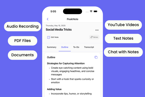
PeakNote: AI Note Taker & Voice Recorder App
AI note taker for voice recording, meeting transcription, and smart summaries
Cloud Infrastructure Platform
Simple, affordable cloud hosting for developers and businesses
Bookmark Folders for ChatGPT
Search Your ChatGPT History and Manage Your Chats in Folders
More Developer Tools
HumanWhisper Chat Assistant
AI-powered chat assistant for fast, accurate answers and productivity
Worxmate.ai
The Ultimate AI-Powered Performance Management and OKR Software
CrawlerCheck
CrawlerCheck: Master your site's visibility.
RankingsFactor
SEO tool for domain analysis, backlink quality, and website ranking metrics